It’s very easy to chart moving averages and standard deviations in Excel 2016, using the Trendline feature.
Excel charts and trendlines of this kind are covered in great depth in our Essential Skills Books and E-books. If you’re not familiar with Excel charts or want to improve your knowledge it could be of great value to you.
Adding a moving average to a chart
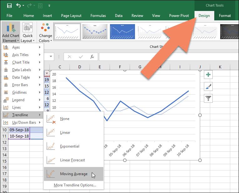
To add a two-period moving average trendline to the chart, click it and then click:
Chart Tools > Design > Chart Layouts > Add Chart Element > Trendline > Moving Average.
Adding standard deviation error bars to a chart
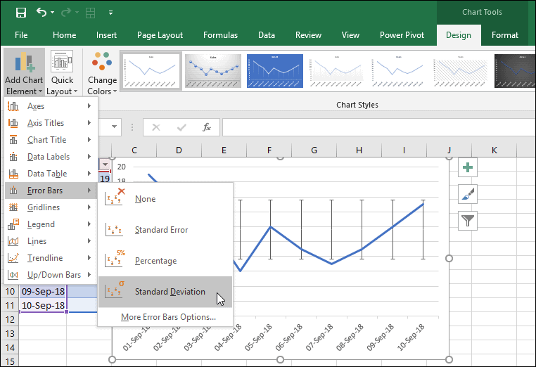
For Standard Deviation, it’s likely that you’ll want to use ‘error bars’ instead of trendlines. Error bars work in almost exactly the same way as trendlines. To add standard deviation error bars, click: Chart Tools > Design > Chart Layouts > Add Chart Element > Error Bars > Error Bars with Standard Deviation.
Calculating average and standard deviation separately
If these options aren’t what you’re looking for, you may want to calculate the average and standard deviation figures within your data by using the AVERAGE and STDEV functions. You can then create charts based upon the results of your calculations.
If Excel formulas and functions aren’t familiar to you, you could find our free Basic Skills E-book extremely useful. Basic Skills will teach you the basics of Excel formulas as well as many other basic Excel skills.
Advanced functions are covered in our Expert Skills Books and E-books.
