- Excel 365
- Excel 2021
- Excel 2019
- Excel 2016
- February 12, 2022
- No Comments
Excel column charts have gaps between their bars by default.
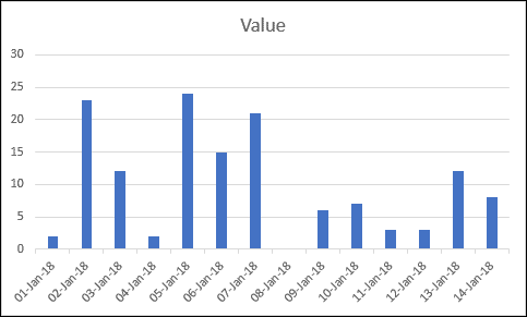
Not everyone likes this default appearance, but fortunately it is possible to change the size of the gaps between bars and even remove them altogether.
1. Open the Format Data Series task pane
Right-click on one of the bars in your chart and click Format Data Series from the shortcut menu.
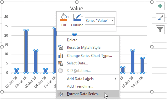
The Format Data Series task pane appears on the right-hand side of the screen, offering many different options.
Our Essential Skills course goes into great depth about formatting charts, but for the moment the Gap Width setting is the one you are interested in.
If this isn’t working quite the same way for you, it’s probably because you are using a legacy version of Excel. You should be able to figure out any differences found if you are not using the current version.
2. Set the Gap Width property
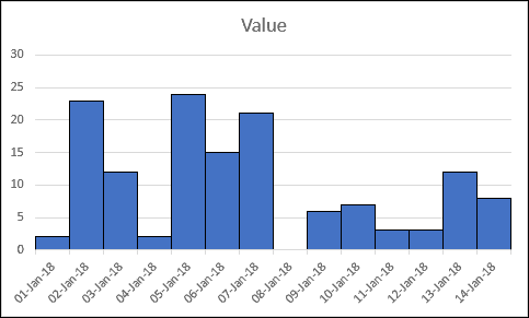
You should see a Gap Width setting on the Format Data Series task pane. You can use this slider to change the gap widths to your liking.

Your chart should change immediately!
Our Essential Skills course contains much, much more about chart formatting. I’d highly recommend it if you want to improve your Excel skills.


These are the only up-to-date Excel books currently published and includes the new Dynamic Arrays features.
They are also the only books that will teach you absolutely every Excel skill including Power Pivot, OLAP and DAX.
Some of the things you will learn

